App Development Simplified with Hilla Components
Intro
In the area of application development, time and efficiency are of the essence. As developers, we are constantly on the lookout for tools that can streamline our workflow while enhancing the end user experience. This is the exact use case of Hilla, a robust framework that ties the best of Java on the server side and TypeScript on the client side. With Hilla’s included web components, creating interactive and visually appealing user interfaces becomes less of a chore and more of a creative endeavor. In this blog, I’ll explore how I utilized some of these web components and how they simplified my app development.
Using the Login Component
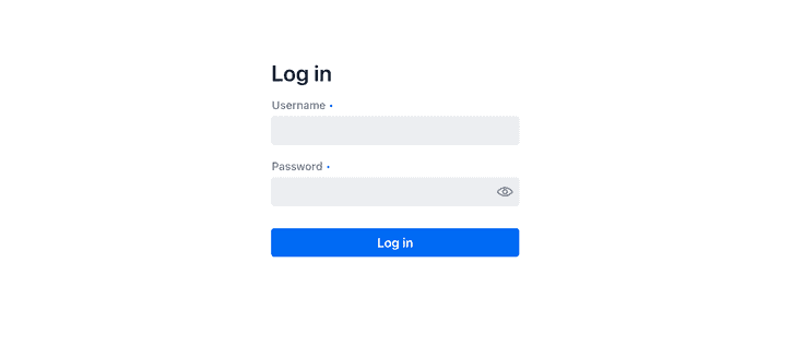
The initial interaction a user has with my project begins with the login. Utilizing Hilla's LoginForm component, as shown below, significantly simplified this process. It seamlessly managed the inclusion of name and username fields, while also handling error messaging for invalid login attempts. This reduced focus on syntax and increased focus on functionality was a common theme while implementing these various components.
import {LoginForm} from "@hilla/react-components/LoginForm.js";
export function LoginView() {
   return(
       <div className="flex items-center justify-center h-full">
           <LoginForm action="login" noForgotPassword />
       </div>
   )
}
Adding structure with AppLayout
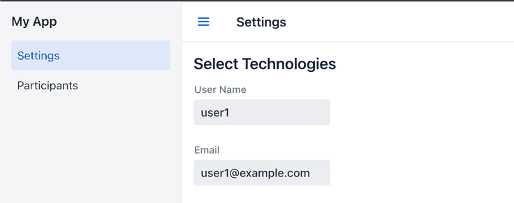
Following the login, the user is taken to a page giving them the option to select technologies and whether they wish to be a mentor or mentee. This is where I utilized the AppLayout component. Hilla’s AppLayout component helps the user navigate through the application. This component (as viewed in the MainLayout file below) encompasses a horizontal nav bar, a collapsible drawer, and a dedicated content area. The Drawer toggle feature is especially useful, enabling easy hide/show behavior. AppLayout is fully-responsive, adjusting automatically to fit desktop, tablet, and mobile screen sizes.
export default function MainLayout() {
   const currentTitle = useRouteMetadata()?.title ?? 'My App';
   return (
       <AppLayout primarySection="drawer">
           <div slot="drawer" className="flex flex-col justify-between h-full p-m">
               <header className="flex flex-col gap-m">
                   <h1 className="text-l m-0">My App</h1>
                   <nav>
                       <NavLink className={navLinkClasses} to="/">
                           Settings
                       </NavLink>
                       <NavLink className={navLinkClasses} to="/participants">
                           Participants
                       </NavLink>
                   </nav>
               </header>
           </div>
Hilla Radio buttons
The next task is a common one in web applications, user interaction with choices. HTML5 already offers through the select tag a functional component set. In this case however, I chose the Hilla component set to give my application a consistent look and behavior. The RadioGroup gives the ability for the logged in user to choose a technology choice and role. One advantage of using Hilla is the form library automatically populates the chosen values and writes it back to the model. That step saved me from writing code while ensuring the correct data type is available to be displayed and utilized for mentor mentee matching.
const {model, field, read, submit} = useForm(ParticipantDTOModel,  {
        onSubmit: async (participant) => {
            const saved = await ParticipantService.save(participant);
            read(saved);

            navigate('/participants');
        }
})<CheckboxGroup label="Technologies">
<Checkbox value={Technology.PYTHON} label="Python" {...field(model.technologies)}/>
<Checkbox value={Technology.JAVA} label="Java" {...field(model.technologies)}/>
<Checkbox value={Technology.JAVASCRIPT} label="Javascript" {...field(model.technologies)}/>
</CheckboxGroup>
<RadioGroup>
<RadioButton value="mentor" label="Mentor" />
<RadioButton value="mentee" label="Mentee" />
</RadioGroup>
Simplicity of the Hilla Grid
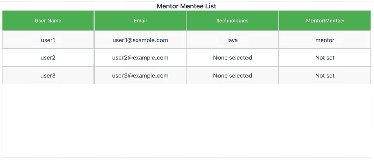
Let’s transition from selecting data to displaying it. In my project, the ParticipantView component utilizes the Hilla Grid to tabulate the list of participants, presenting the data in an organized, readable format. Some advanced features at my disposal include drag and drop functionality, data editing, and even resorting. Hilla Grids are well-suited for everything from text fields to buttons within cells which enhance data visualization and make this a great tool in any developer’s toolkit when it comes to building out data-driven interfaces.
return (
   <div className="App mx-auto">
       <h1 className="text-l m-0 text-center">Mentor Mentee List</h1>
       <Grid items={data}>
           <GridColumn header="User Name" path="userName" />
           <GridColumn header="Email" path="email" />
           <GridColumn header="Technologies" path="technologies" />
        </Grid>
   </div>
);
Wrap-up
Hilla has been a handy companion in simplifying the app development process. The consistency across the different components ensures a cohesive user interface making the app more user-friendly. As I’ve shown, the components reduce boilerplate code, allowing the developers to focus more on the business logic. Visit Hilla’s component documentation for the full list along with code examples you can try. https://hilla.dev/docs/react/components. Follow us here at @hillaframework on Twitter for updates, and be sure to tag us when you share cool stuff you've built with Hilla!