Validating User Input
Hilla helps you validate user input based on the backend Java data model.
It reads the Bean Validation (JSR-380) annotations on your Java data types and applies these constraints to the user input.
Validation is enabled by default in all forms created with the Hilla Binder API.
When creating forms in TypeScript with React and the Binder API, all data model constraints are automatically applied to your form fields.
The Binder API validates most standard constraints, such as @Max, @Size, @Pattern, @Email on the client side, without a network round-trip delay
(see the full list in the Built-In Client-Side Validators section later).
When you eventually submit data to server-side endpoints, Hilla validates all constraints on the server as well.
The Binder API updates the form to show any server-side validation errors.
Specifying Constraints
Constraints are specified as a part of the data model, in the Java code. You can use any of the built-in constraints in addition to your own.
import jakarta.validation.constraints.Email;
import jakarta.validation.constraints.NotBlank;

public class Employee {
    @NotBlank
    private String username;

    private String title;

    @Email(message = "Please enter a valid e-mail address")
    private String email;

    // + other fields, constructors, setters and getters
}
During the build, when Hilla generates TypeScript types, it includes the constraint information in the generated model types. All forms that work with the same entity type have the same set of constraints.
When you create a form for an entity type, it gets the user input validation automatically.
import { AbstractModel } from '@hilla/form';
import { FieldDirectiveResult, useForm } from '@hilla/react-form';
import EmployeeModel from 'Frontend/generated/com/example/application/EmployeeModel';
// other imports
export default function EmployeeView() {
const { model, field } = useForm(EmployeeModel);
return (
<>
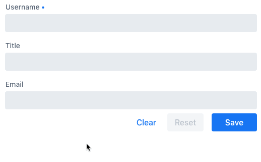
<TextField label="Username" {...field(model.username)}></TextField>
<TextField label="Title" {...field(model.title)}></TextField>
<EmailField label="Email" {...field(model.email)}></EmailField>
</>
);
}
Defining Custom Constraints
The Bean Validation standard allows the creation of arbitrary custom constraints.
The Hilla form Binder API also supports such custom constraints.
The example that follows shows how to create and use a custom @StrongPassword constraint:
@Retention(RUNTIME)
@Target({ METHOD, FIELD, ANNOTATION_TYPE, CONSTRUCTOR, PARAMETER, TYPE_USE })
@Constraint(validatedBy = { StrongPasswordValidator.class })
public @interface StrongPassword {

    // min required password strength on the scale from 1 to 5
    int minStrength() default 4;

    String message() default "Please enter a strong password";
    Class<?>[] groups() default { };
    Class<? extends Payload>[] payload() default { };
}public class StrongPasswordValidator implements ConstraintValidator<StrongPassword, String> {
@Override
public boolean isValid(String object, ConstraintValidatorContext constraintContext) {
// Use the zxcvbn library to measure the password strength
Strength strength = zxcvbn.measure(object);
// fail the validation if the measured strength is insufficient
if (strength.getScore() < minStrength) {
constraintContext
.buildConstraintViolationWithTemplate(
strength.getFeedback().getWarning())
.addConstraintViolation();
return false;
}
return true;
}
}In this example, we use a third-party library to measure password strength in order to implement the custom validator.
Add a dependency to your pom.xml:
<dependency>
    <groupId>com.nulab-inc</groupId>
    <artifactId>zxcvbn</artifactId>
    <version>1.3.0</version>
</dependency>public class Employee {
@StrongPassword
private String password;
}No additional steps are needed to start using the new validation rules in forms.
The field() directive applies all server-side constraints automatically.
import { useForm } from '@hilla/react-form';
import EmployeeModel from 'Frontend/generated/com/example/application/EmployeeModel';
import { EmployeeEndpoint } from 'Frontend/generated/endpoints';
import { Button } from "@hilla/react-components/Button.js";
import { PasswordField } from "@hilla/react-components/PasswordField.js";
export default function ProfileView() {
const { model, submit, field } = useForm(EmployeeModel, {
onSubmit: async (e) => {
await EmployeeEndpoint.saveEmployee(e);
}
});
return (
<>
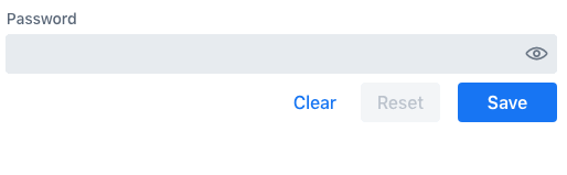
<PasswordField label="Password" {...field(model.password)}></PasswordField>
<Button onClick={submit}>Submit</Button>
</>
);
}However, in this example, validation happens only after the form is submitted. To validate user input immediately, as the user types, you would need to define a validator in TypeScript, as well. The following section shows how to do this.
Defining Custom Client-Side Validators
To give instant feedback to users as they type, you can define validators in TypeScript, so that they are executed in the browser, without a network round trip.
The Hilla form Binder API allows you to add validators for both individual fields, and for the form as a whole (for example to implement cross-field validation).
Client-side validators are executed before the server-side validation is invoked.
|
Warning
| Validation ALWAYS needs to run on the server in order for your application to be secure. Additionally, you can validate input in the browser immediately the user types, to give a better user experience. |
Adding Validators for a Single Field
When a validation rule concerns a single field, a client-side validator should be added with the addValidator() call on the binder node for that particular field.
This is the case with the custom @StrongPassword constraint example.
import { useForm, useFormPart } from '@hilla/react-form';
import * as owasp from 'owasp-password-strength-test';

import { useEffect } from 'react'

export default function ProfileView() {
  const { model } = useForm(EmployeeModel);

  const passwordField = useFormPart(model.password);
  // use effect to make it run only once
  useEffect(() => {
    passwordField.addValidator({
      message: 'Please enter a strong password',
      validate: (password: string) => {
        return owasp.test(password);
      },
    });
  }, []);

  // ...

}
In this example, we use a third-party library to measure password strength in order to implement the custom validator.
Add a dependency to your package.json:
npm install --save owasp-password-strength-test
npm install --save-dev @types/owasp-password-strength-test
Adding Cross-Field Validators
When a validation rule is based on several fields, a client-side validator should be added with the addValidator() call on the form binder directly.
A typical example where this would be needed is checking that a password is repeated correctly:


import { useForm } from '@hilla/react-form';
import { useEffect } from 'react'

export default function ProfileView() {

  const { model, field, addValidator } = useForm(EmployeeModel);

  useEffect(() => {
    addValidator({
      message: 'Please check that the password is repeated correctly',
      validate: (value: Employee) => {
        if (value.password != value.repeatPassword) {
          return [{ property: model.password }];
        }
        return [];
      }
    });
  }, []);

  return (
      <>
        <PasswordField label="Password" {...field(model.password)}></PasswordField>
        <PasswordField label="Repeat password" {...field(model.repeatPassword)}></PasswordField>
      </>
    );
}
When record-level validation fails, there are cases when you want to mark several fields as invalid.
To do this with the @hilla/form validator APIs, you can return an array of { property, message } records from the validate() callback.
Returning an empty array is equivalent to returning true, meaning that validation has passed.
If you need to indicate a validation failure without marking any particular field as invalid, return false.
Marking Fields as Required
To mark a form field as 'required', you can add a @NotNull or @NotEmpty constraint to the corresponding property in the Java type.
@Size with a min value greater than 0 also causes a field to be required.
Alternatively, you can set the impliesRequired property when adding a custom validator in TypeScript, as shown earlier, in the xref:binder-validation section.
The fields marked as required have their required property set by the field() directive.
Hence, validation fails if they are left empty.
Built-In Client-Side Validators
The @hilla/form package provides the client-side validators for the following JSR-380 built-in constraints:
-
Email– The string must be a well-formed email address -
Null– Must benull -
NotNull– Must not benull -
NotEmpty– Must not benullnor empty (must have alengthproperty, for example string or array) -
NotBlank– Must not benulland must contain at least one non-whitespace character -
AssertTrue– Must betrue -
AssertFalse– Must befalse -
Min– Must be a number greater than or equal to the specified minimum-
Additional options:
{ value: number | string }
-
-
Max- Must be a number less than or equal to the specified maximum-
Additional options:
{ value: number | string }
-
-
DecimalMin– Must be a number greater than or equal to the specified minimum-
Additional options:
{ value: number | string, inclusive: boolean | undefined }
-
-
DecimalMax– Must be a number less than or equal to the specified maximum-
Additional options:
{ value: number | string, inclusive: boolean | undefined }
-
-
Negative– Must be a negative number (0 is considered to be an invalid value) -
NegativeOrZero– Must be a negative number or 0 -
Positive– Must be a positive number (0 is considered to be an invalid value) -
PositiveOrZero– Must be a positive number or 0 -
Size– Size must be in the specified range, inclusive; must have alengthproperty, for example a string or an array-
Additional options:
{ min?: number, max?: number }
-
-
Digits– Must be a number within the specified range-
Additional options:
{ integer: number, fraction: number }
-
-
Past– A date string in the past -
PastOrPresent– A date string in the past or present -
Future– A date string in the future -
FutureOrPresent– A date string in the future or present -
Pattern– Must match the specified regular expression-
Additional options:
{ regexp: RegExp | string }
-
These are usually used automatically.
However, you could also add them to selected fields manually
by obtaining the UseFormPartResult instance and using the addValidator;
for example, addValidator(new Size({max: 10, message: 'Must be 10 characters or less'})).
All the built-in validators take one constructor parameter, which is usually an optional options object with a message?: string property (which defaults to 'invalid').
However, some validators have additional options or support other argument types, instead of the options object.
For example, the Min validator requires a value: number | string option.
This can be given as part of the options object.
Alternatively, you can pass just the minimum value itself, instead of the options object (if you don’t want to set message and leave it as the default 'invalid').
import { Email, Min, NotEmpty, Size } from '@hilla/form';
import { useForm, useFormPart } from '@hilla/react-form';

export default function ProfileView() {

  const { model, field, addValidator } = useForm(PersonModel);

  const nameField = useFormPart(model.name);
  const usernameField = useFormPart(model.username);
  const ageField = useFormPart(model.age);
  const emailField = useFormPart(model.email);

  useEffect(() => {
    nameField.addValidator(
      new NotEmpty({
        message: 'Please enter a name'
      }));

    usernameField.addValidator(
      new Size({
        message: 'Please pick a username 3 to 15 symbols long',
        min: 3,
        max: 15
      }));

    ageField.addValidator(
      new Min({
        message: 'Please enter an age of 18 or above',
        value: 18
      }));

    emailField.addValidator(new Email());
  }, []);

  return (
      <>
        <TextField label="Name" {...field(model.name)}></TextField>
        <TextField label="Username" {...field(model.username)}></TextField>
        <IntegerField label="Age" {...field(model.age)}></IntegerField>
        <EmailField label="Email" {...field(model.email)}></EmailField>
      </>
    );
}